Crafting a Contemporary Dining Experience
Developing a visual identity system and communication design that connected gastronomy, retail and lifestyle into a distinctive hospitality brand.
CLIENT
Tappo Bar
COUNTRY
Croatia
YEAR
2017
SERVICES
Brand Strategy · Visual Identity Design · Visual Identity System · Creative Direction · Communication Design · Editorial Design · Packaging Design · Social Media
Tappo was conceived as more than a restaurant. Positioned at the intersection of gastronomy, social experience and lifestyle culture, the venue combined quality food, carefully selected drinks, boutique retail products and a contemporary hospitality experience under a single brand. The challenge was to develop a visual identity system capable of unifying these diverse elements while maintaining a clear and recognisable character across every customer touchpoint.
The project began with a strategic approach to the brand’s positioning, establishing a visual framework that could communicate its broader offer and distinctive character. Rather than focusing solely on food or restaurant culture, the identity needed to represent a concept built around quality, authenticity and experience. The goal was to create a contemporary brand identity that felt approachable while reflecting the premium nature of the offer and providing a strong foundation for long-term communication.
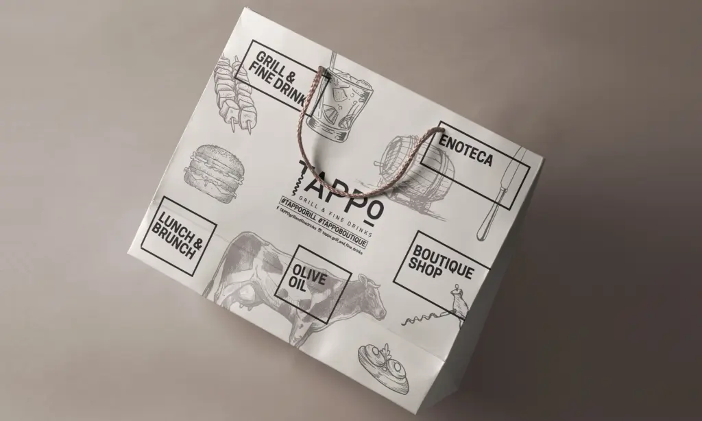
At the core of the project was a structured visual identity system built around typography, illustration and carefully balanced composition. A restrained colour palette combined with hand-drawn food and beverage illustrations created a recognisable aesthetic that communicated craftsmanship and attention to detail. These illustrations became an integral part of the visual communication system, providing storytelling across menus, packaging, promotional materials and digital communication while reinforcing the brand’s personality.
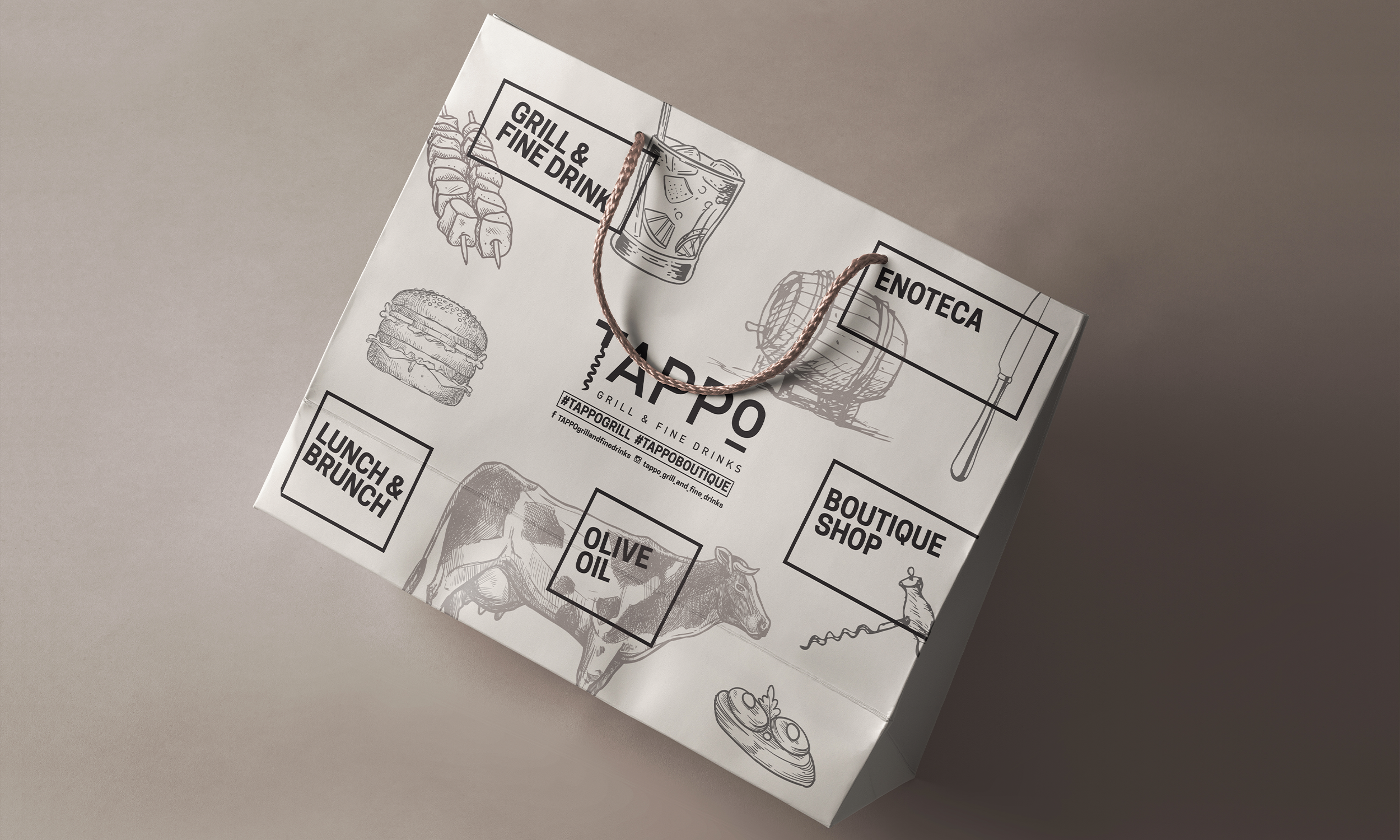
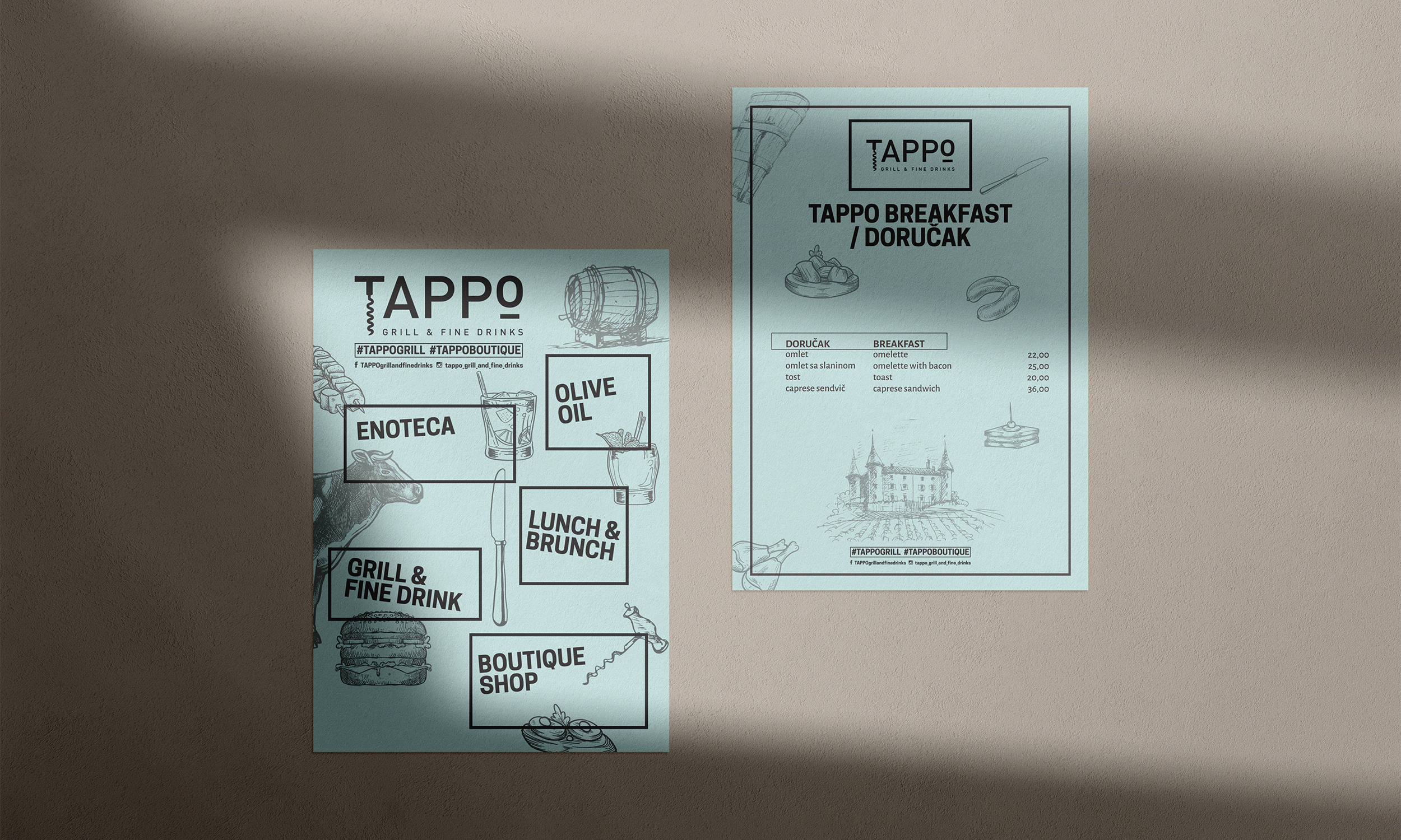
A significant part of the brand strategy was the development of a flexible identity system capable of supporting multiple business segments within the same brand environment. The visual language was designed to accommodate categories including Grill & Fine Drinks, Enoteca, Boutique Shop, Olive Oil and Breakfast & Brunch offers. Rather than treating each category as a separate entity, the design established a unified framework that allowed them to coexist under a single recognisable brand structure. This approach strengthened brand consistency while enabling flexibility across different applications and customer experiences.
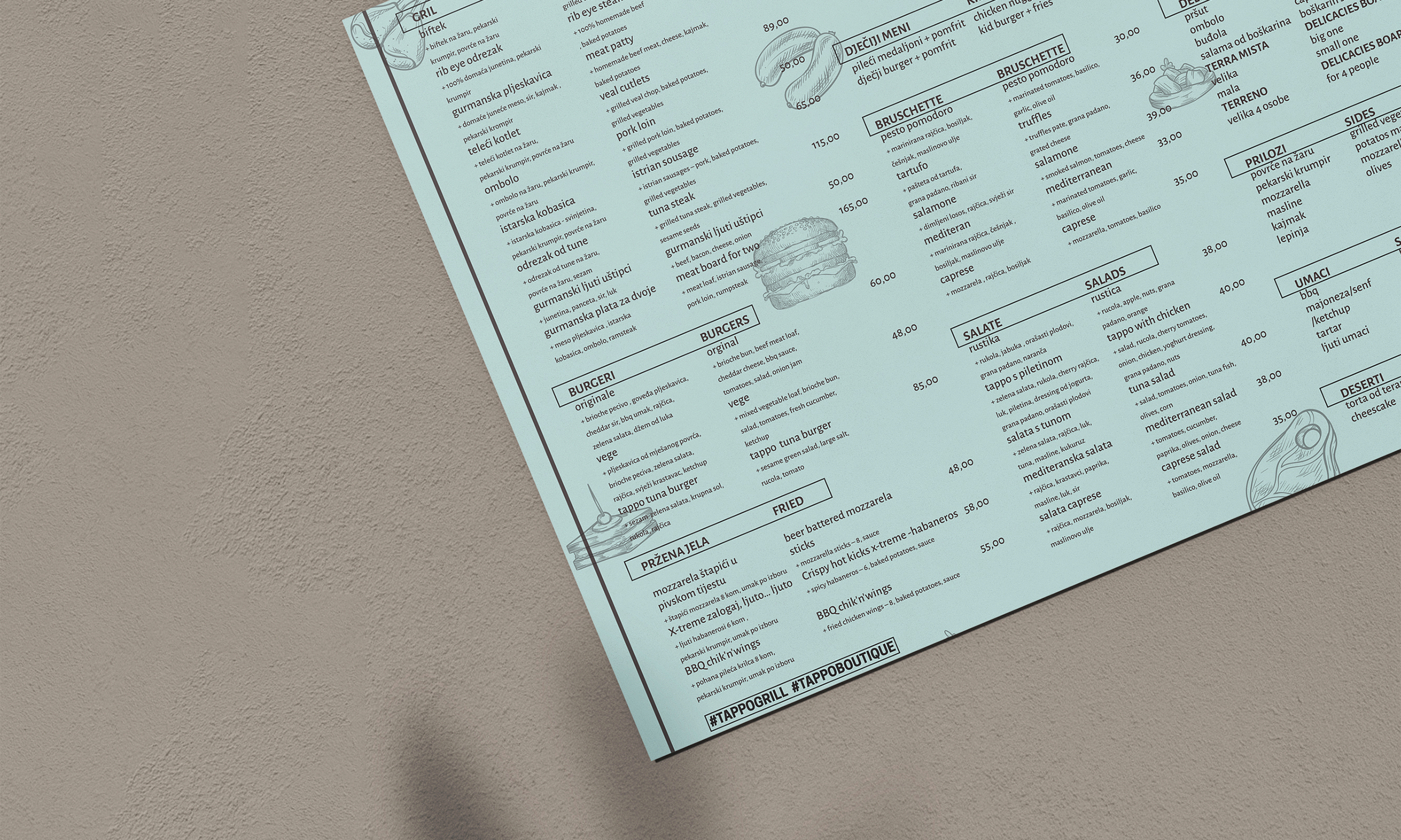
Particular attention was given to communication design and editorial design. Menus, promotional leaflets, takeaway packaging and branded collateral were developed as extensions of the visual identity rather than as standalone design pieces. Each element followed the same visual principles, ensuring a cohesive experience from the first point of contact through to the dining experience itself. Typography, illustration, composition and material choices worked together to create a communication system that felt deliberate, organised and immediately recognisable.
The project also included packaging design, extending the Tappo brand into products and takeaway applications. Packaging was treated as another customer touchpoint within the broader visual identity system, allowing the same principles of clarity, craftsmanship and contemporary character to continue beyond the physical space of the restaurant.
Creative direction extended across social media and digital communication. A visual framework was developed for online platforms, allowing the brand to maintain consistency across social channels while showcasing food, atmosphere and events in a way that aligned with the overall identity. By establishing clear visual principles, digital content became a natural continuation of the brand experience rather than a disconnected marketing tool.
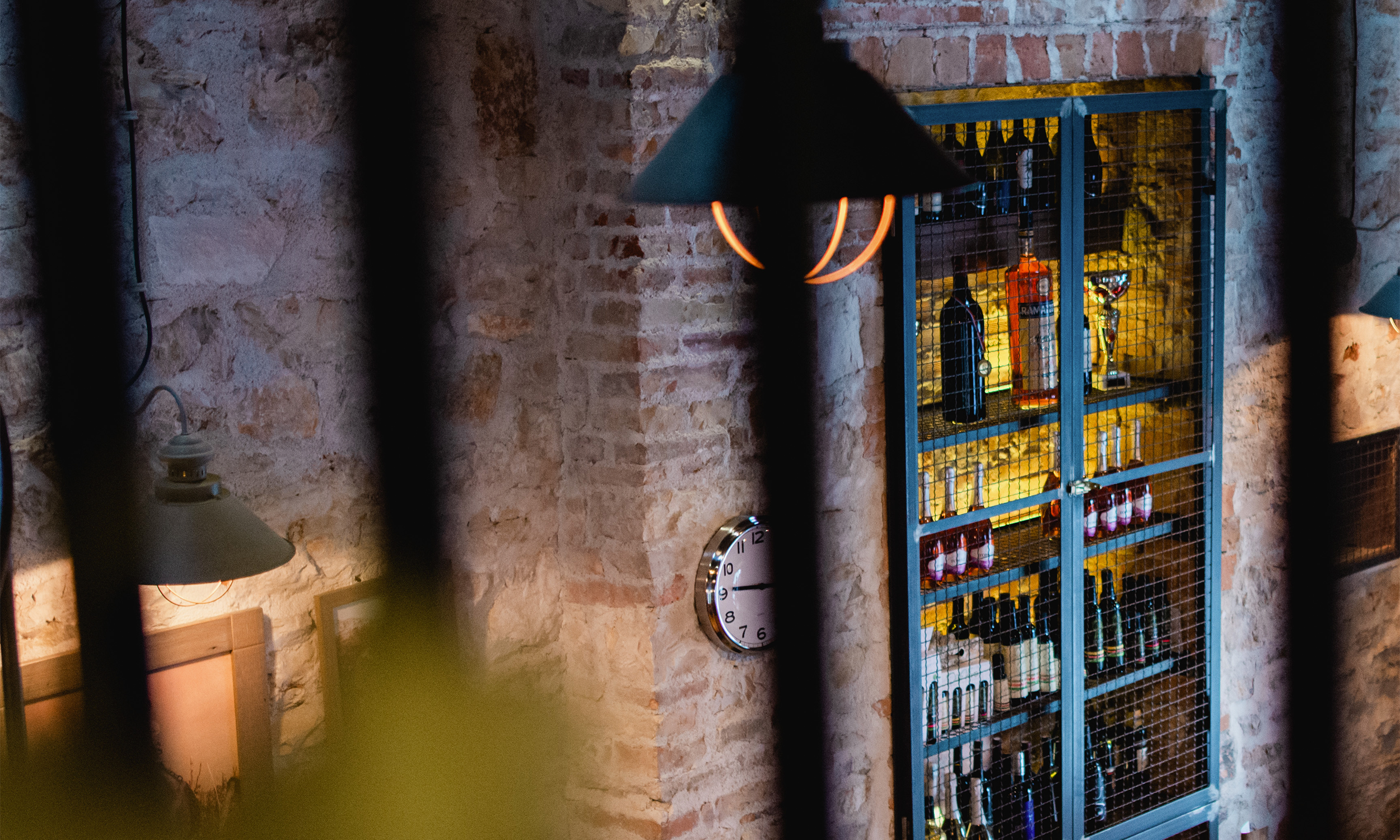
Beyond graphic communication, the visual identity contributed to the atmosphere of the venue itself. The industrial interior, exposed brick walls, carefully selected materials and curated product displays created a setting that reflected the values expressed through the visual system. Branding elements were integrated naturally into the environment, supporting the overall customer experience without overwhelming the space. This relationship between physical and visual identity helped create a stronger sense of place and reinforced the character of the brand.
A key objective throughout the project was longevity. Instead of relying on short-lived hospitality trends, the focus was placed on creating a timeless brand identity system capable of adapting to future growth and changing communication needs. The identity was designed to remain relevant across seasonal campaigns, new product categories and evolving customer expectations while preserving a consistent and recognisable presence.
Developed in 2017 for Tappo Bar in Croatia, the project established a coherent visual identity and communication system connecting hospitality, retail and lifestyle under one brand. Through a combination of brand strategy, visual identity design, creative direction and communication design, the identity provided a flexible foundation for the brand’s physical and digital presence.
More than a collection of graphic elements, the project became a framework for storytelling and customer experience. By combining clarity, consistency and flexibility, the visual identity system supported the long-term development of the business while giving Tappo a distinctive and recognisable presence within the local hospitality landscape.