Making Sustainability Accessible Through Creativity
A visual identity and communication system designed to engage children and young people with the principles of sustainable development.
CLIENT
City of Zadar
COUNTRY
Croatia
YEAR
2019
SERVICES
Brand Identity · Visual Identity System · Art Direction · Print Design · Communication Design
Overview
AMOR was developed as an educational initiative promoting sustainable development among children and young people. Created for the City of Zadar, the project addressed a growing challenge: how to communicate complex environmental, social and sustainability topics to younger audiences in a way that is understandable, engaging and inspiring. Instead of traditional educational formats, the goal was to build a visual and communication framework that turns learning into an interactive, positive experience.
The Challenge
The main challenge was accessibility. Sustainability, responsible resource management and long-term environmental awareness are usually presented through technical language and institutional communication. That may work for professionals, but it rarely resonates with younger generations. AMOR needed a completely different strategy: one that simplifies complex topics without diminishing their importance, while encouraging curiosity, participation and active learning.
The Approach
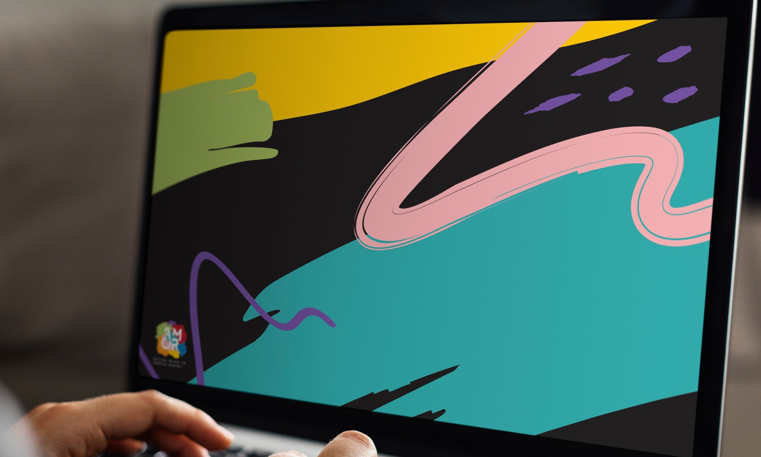
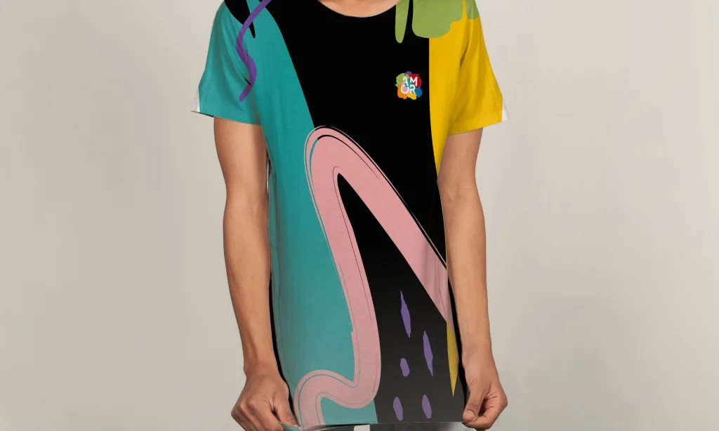
The visual identity became the central tool. We created a vibrant, expressive visual language that captures attention while staying approachable. Rather than relying on conventional environmental imagery, the identity introduces a playful system of abstract forms, bold colours and dynamic compositions, giving the project a distinctive character that feels contemporary, energetic and relevant to young people.
Concept: Diversity and Interconnectedness
At the core of the identity is the idea of diversity and interconnectedness. Sustainability is about the relationships between people, communities and the environment, and the visual system reflects this. Organic shapes, layered graphic elements and expressive colour combinations form a flexible identity that can represent a wide range of educational themes and activities, encouraging exploration while supporting the project’s educational goals.
Emotion and Engagement
Because the audience consisted mainly of children and young people, the identity had to feel welcoming rather than institutional. Colour played a key role in creating a positive, optimistic atmosphere. Together with expressive illustrations and playful graphic structures, it encouraged engagement and reinforced the educational message. The design worked as an invitation to take part rather than simply a source of information, building a stronger connection between participants and the topics presented.
A Complete Identity System
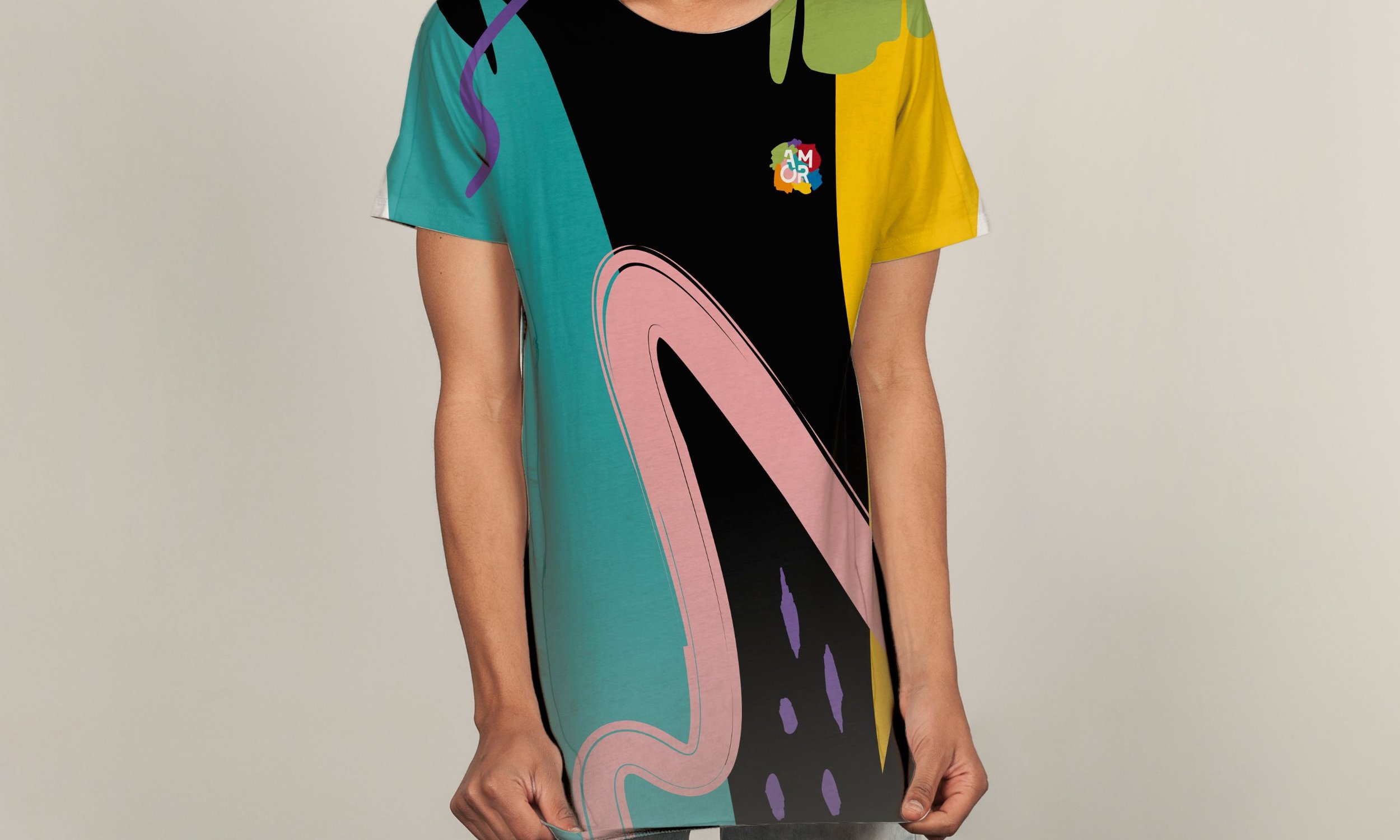
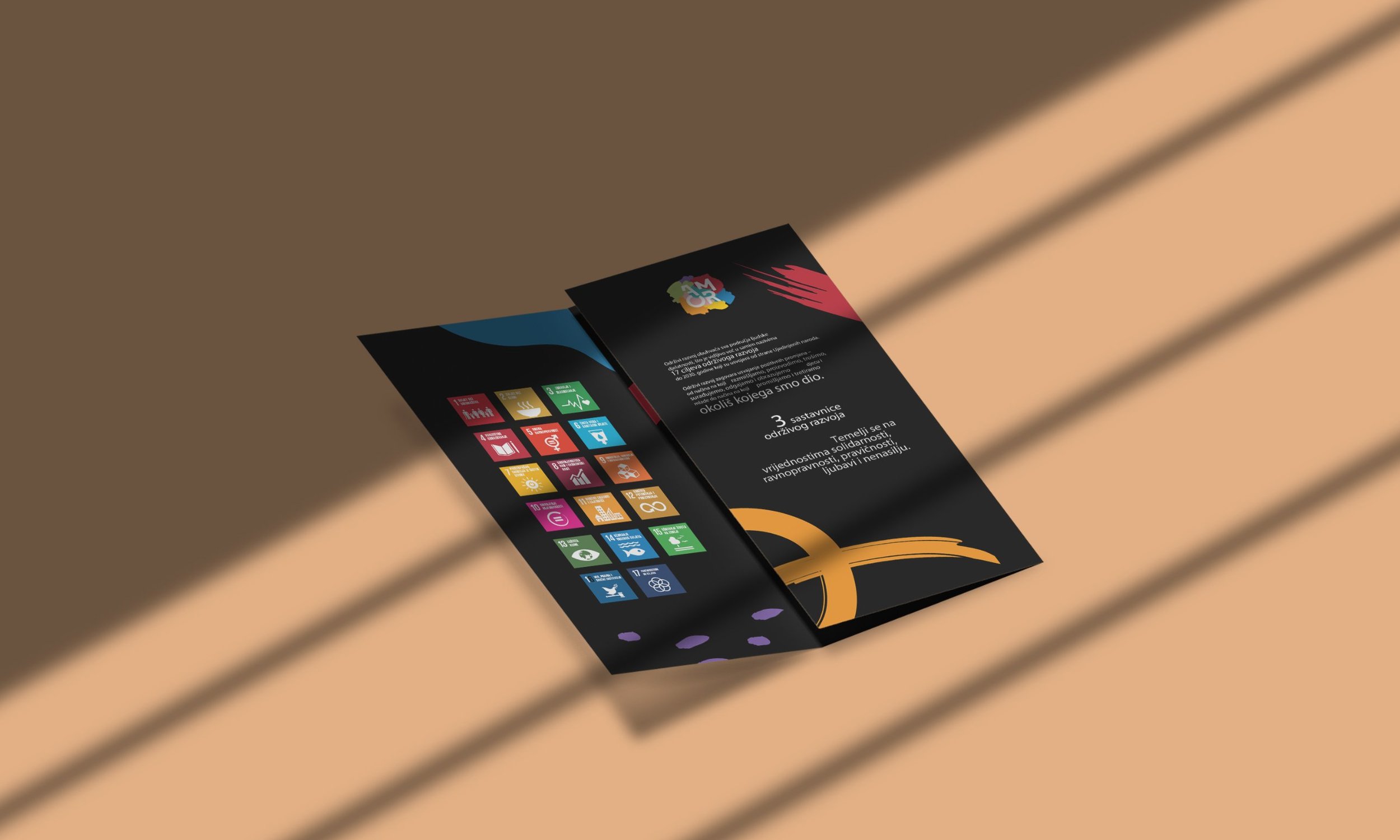
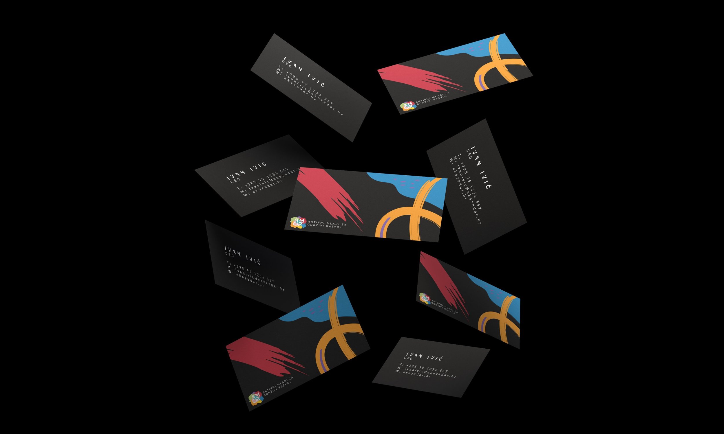
We developed a full visual identity system that works across multiple channels. It was applied to promotional materials, educational resources, branded merchandise, event applications and public communication initiatives. Clear design principles and a consistent framework kept the project recognisable in any format or medium.
Flexibility in Use
The system’s flexibility supported a broad range of activities. Workshops, educational events, presentations, printed materials and promotional campaigns were all integrated within the same visual framework, ensuring long-term usability and consistency across every public-facing aspect of the initiative.
Result
AMOR established a contemporary visual language that transformed sustainability education into a more engaging and accessible experience. Through strategic communication, visual storytelling and clear educational objectives, the project made complex topics easier to understand and encouraged active participation among younger audiences.
More than a branding project, AMOR became a platform for communication, education and positive social impact, helping younger generations better understand sustainability and their role in shaping a more responsible future.