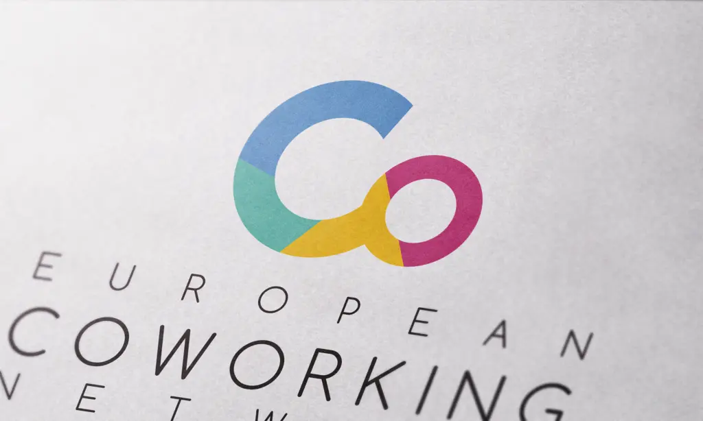
Connecting Ideas Across Europe
Developing a visual identity and communication framework for an international initiative focused on collaboration, innovation and knowledge exchange.
CLIENT
City of Zadar
COUNTRY
Croatia
YEAR
2017
SERVICES
Brand Identity · Visual System · Communication Design · Art Direction · Event Communication
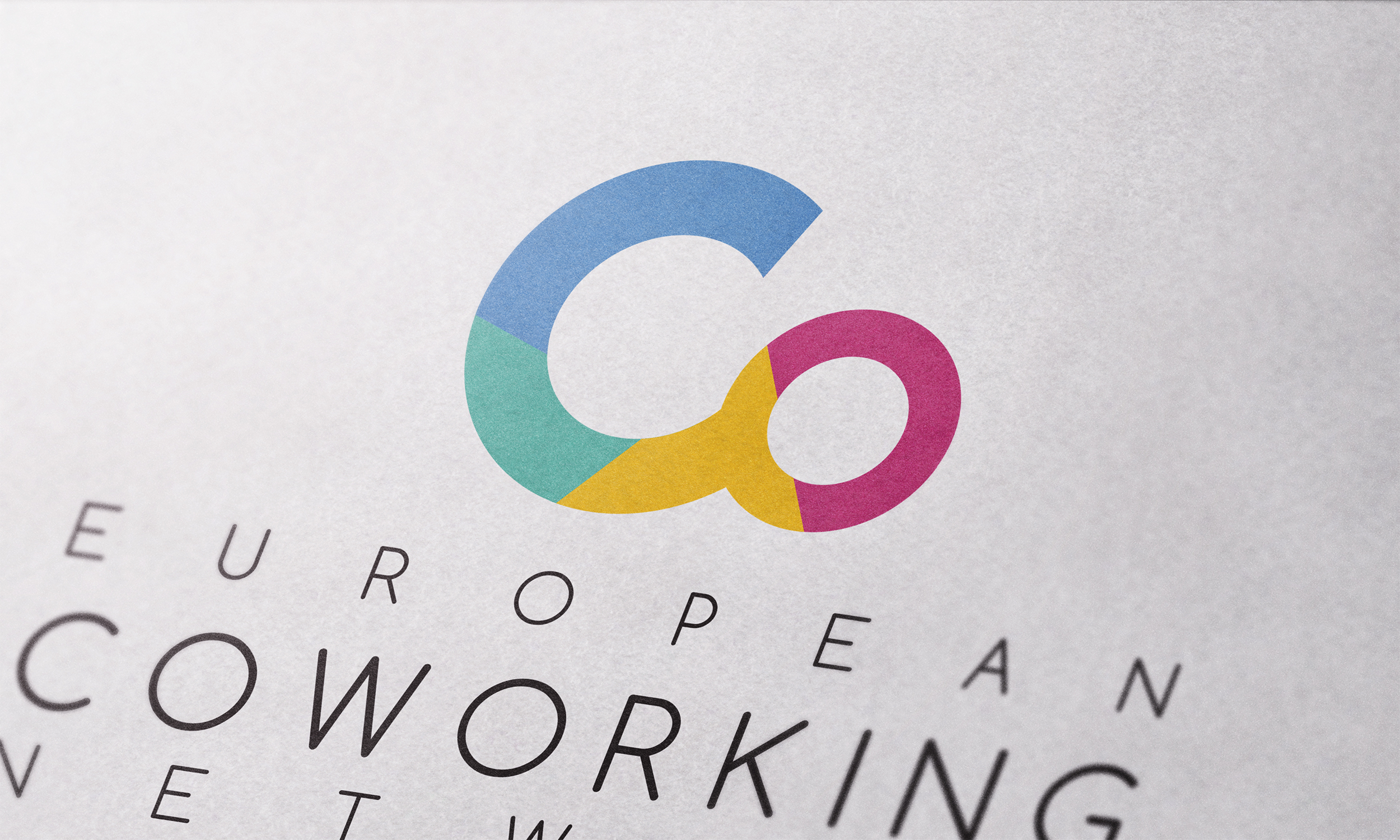
The COW EU project involved the development of a visual identity and communication framework for an international Erasmus+ initiative, bringing together organisations, institutions and professionals from across Europe through collaboration, innovation and knowledge exchange. Coordinated through international partnerships and local activities, the project aimed to explore the growing role of coworking environments as platforms for innovation, professional development and community building. The initiative provided opportunities for participants to exchange experiences, develop new ideas and establish connections capable of generating long-term value beyond the duration of the programme itself.
The challenge was to create a visual identity and communication system capable of supporting a project that operated across different countries, cultures and professional backgrounds. The communication framework needed to remain clear and consistent while addressing a diverse audience that included entrepreneurs, creative professionals, public institutions, educators and project partners. Rather than focusing solely on the event itself, the objective was to develop a visual language capable of representing collaboration as an ongoing process driven by openness, participation and shared knowledge. This strategic approach to coworking branding demonstrates how visual identity can strengthen collaboration while shaping the experience of shared workspaces and innovation hubs.
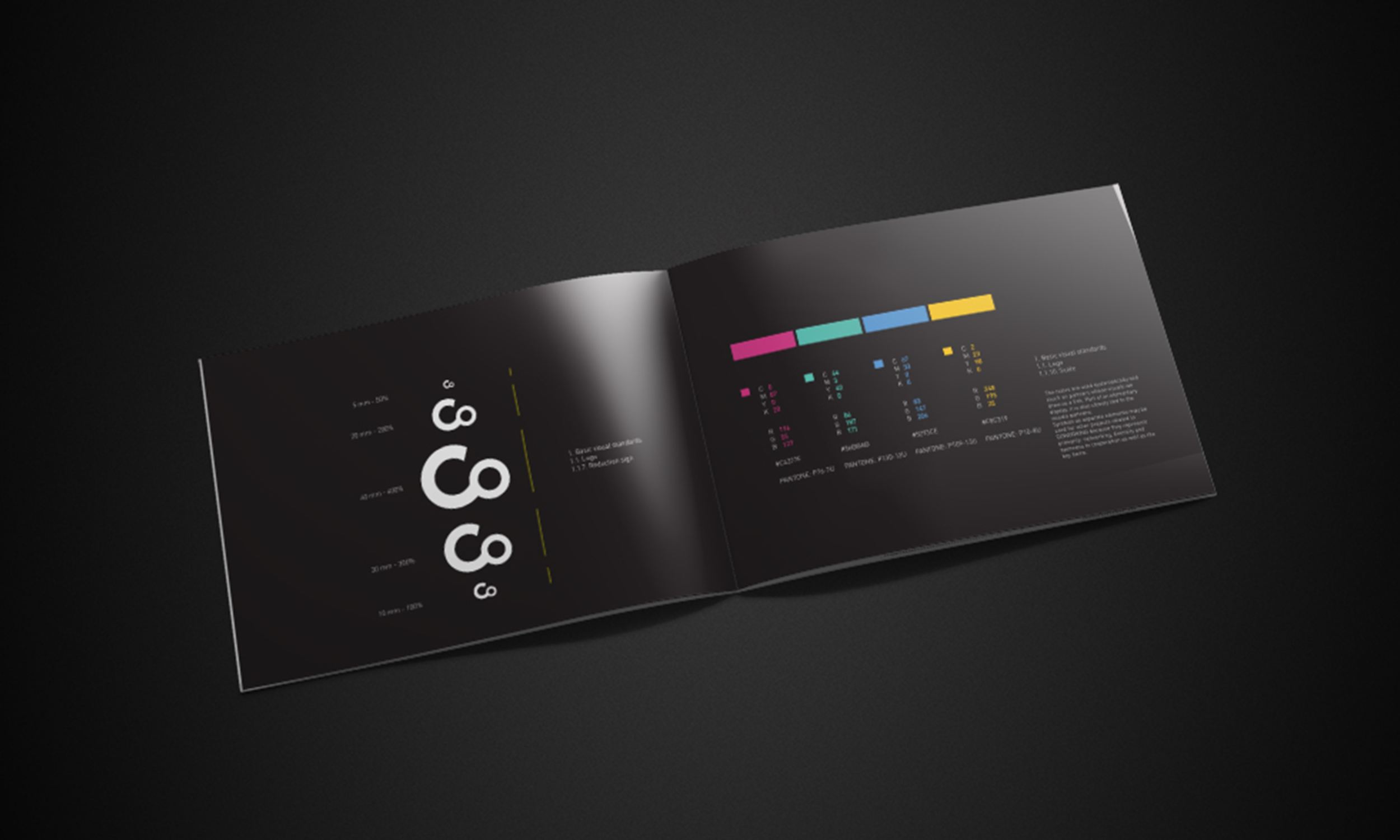
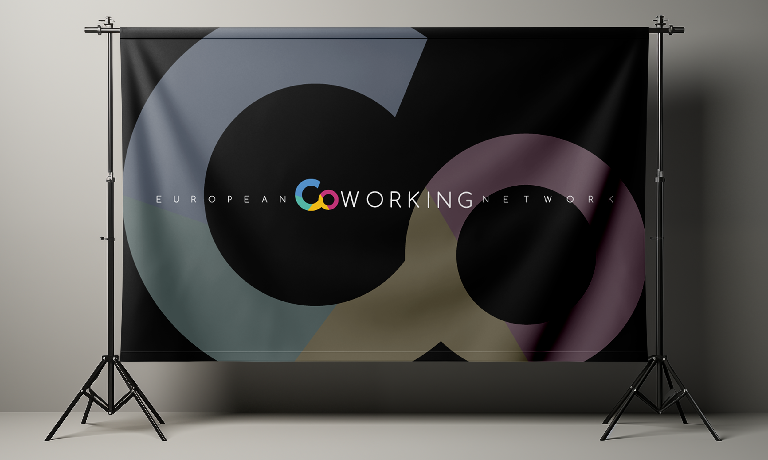
At the core of the project was the development of a flexible visual system designed to function across a broad range of communication materials and event applications. From conferences, workshops and printed publications to presentations, digital communication and on-site event branding, the identity needed to maintain coherence while adapting to different contexts and formats. The flexibility of the system was essential for supporting long-term international partnerships, allowing new activities, events and project outputs to remain visually consistent throughout the duration of the initiative. This approach ensured that every interaction contributed to a unified perception of the project while strengthening recognition among participants and stakeholders.
A key aspect of the design process was the creation of a visual language that reflected connectivity and exchange. The identity was developed around principles of clarity, accessibility and adaptability, allowing information to be communicated efficiently without unnecessary complexity. Typography, graphic structures and supporting visual elements were organised into a consistent framework capable of supporting both formal and informal communication. This balance helped create a professional yet approachable identity aligned with the collaborative nature of the initiative.
Particular attention was given to communication hierarchy and user experience. As the project brought together participants from different countries and professional disciplines, information needed to be presented in a way that was easy to understand and navigate. The visual system therefore prioritised readability and consistency, ensuring that content remained accessible regardless of language, medium or communication channel. This consistency played an important role in strengthening communication across different countries, languages and partner organisations while supporting the project’s educational and networking objectives.
Beyond its visual appearance, the identity functioned as a tool for building connections. It provided a framework through which project activities, workshops, presentations and networking opportunities could be communicated in a cohesive and recognisable way. By establishing a shared visual language, the project was able to reinforce a sense of belonging among participants while supporting the broader goals of cooperation and knowledge sharing. The same strategic thinking also underpins projects focused on educational campaign design, where visual communication helps audiences understand, engage with and retain complex information.
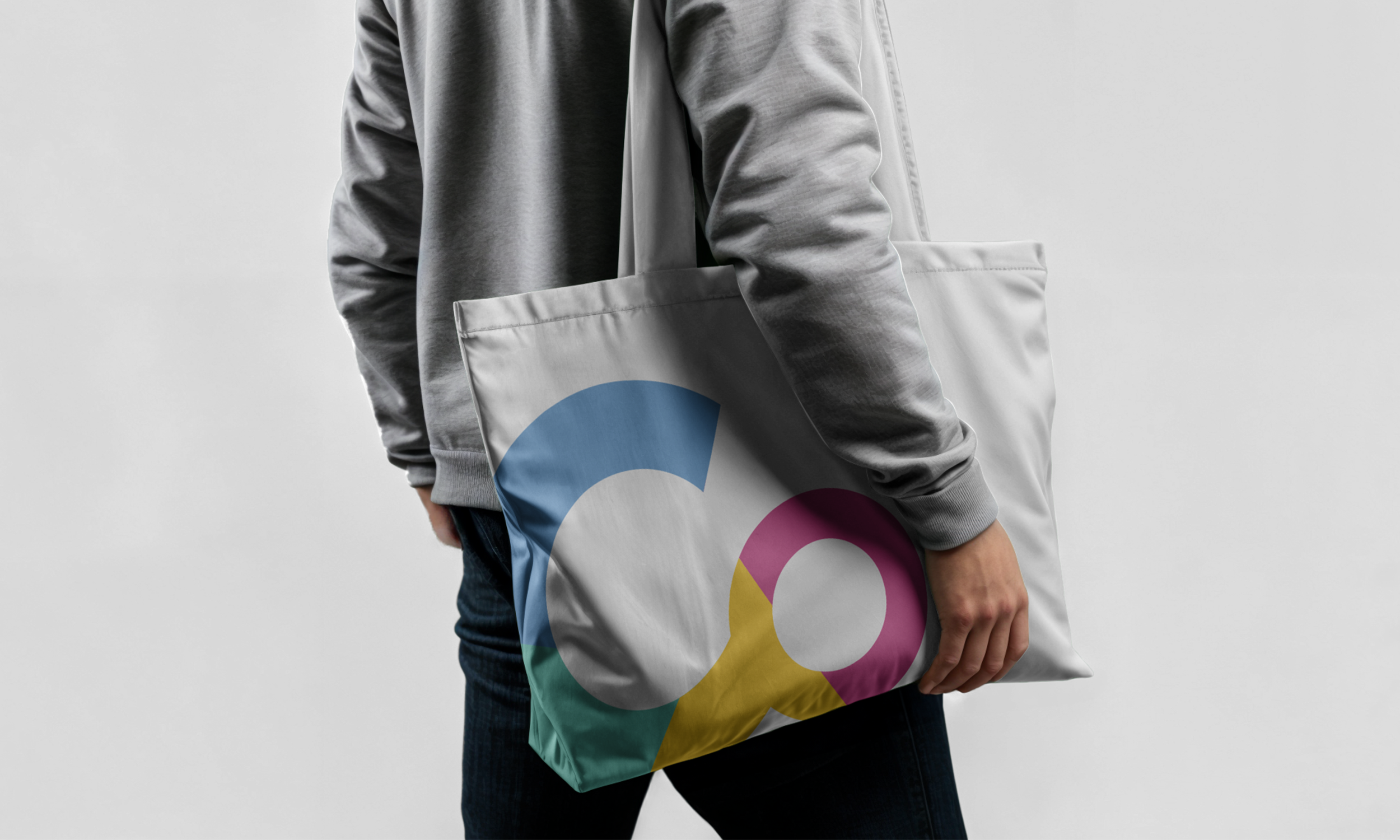
Versatility played an important role throughout the development process. The project required communication materials that could be applied across different locations and future activities without losing consistency. The resulting system was designed to evolve alongside the initiative, providing a stable foundation capable of supporting future programmes, conferences, workshops and collaborative activities while maintaining a clear and recognisable identity.
Developed for the City of Zadar as part of the Erasmus+ European Coworking Network project, the identity established a contemporary visual framework that supported communication, visibility and participant engagement. Through a structured and purpose-driven approach, the project gained a coherent visual presence that reflected its values while strengthening communication across multiple European partners.
The project demonstrates how a flexible visual identity system can support the organisation and communication of international projects beyond geographical boundaries. By providing a consistent framework for conferences, workshops, publications and digital communication, the identity strengthened collaboration between partners while contributing to the long-term visibility and impact of the Erasmus+ initiative. This approach is equally valuable in public awareness campaign design, where clear, accessible and consistent communication helps organisations reach diverse audiences and strengthen public engagement.