Designing Communication Through Support and Trust
Developing a visual identity and communication framework for a project dedicated to supporting victims, witnesses and vulnerable individuals.
CLIENT
Association for the Support of Victims and Witnesses
COUNTRY
Croatia
YEAR
2016
SERVICES
Brand Identity · Visual System · Communication Design · Art Direction · Public Awareness Campaign
The 116 006 project involved the development of a visual identity and communication framework for a public awareness campaign dedicated to supporting victims, witnesses and vulnerable individuals. Operating within a highly sensitive social context, the initiative required a communication approach capable of balancing professionalism, empathy and trust. The objective was not only to raise public awareness of the available support services, but also to create a recognisable and approachable identity that could help reduce barriers to seeking assistance.
The challenge was to develop a visual system capable of communicating complex and often emotionally difficult topics in a clear, accessible and reassuring way. Unlike commercial projects that rely on visibility alone, this initiative required a carefully considered communication framework designed to encourage confidence, understanding and engagement. Every design decision was guided by the need to make sensitive information easier to understand while maintaining the credibility expected from a public support service. The resulting identity demonstrates how educational campaign design can make important social messages more approachable and meaningful for diverse audiences.
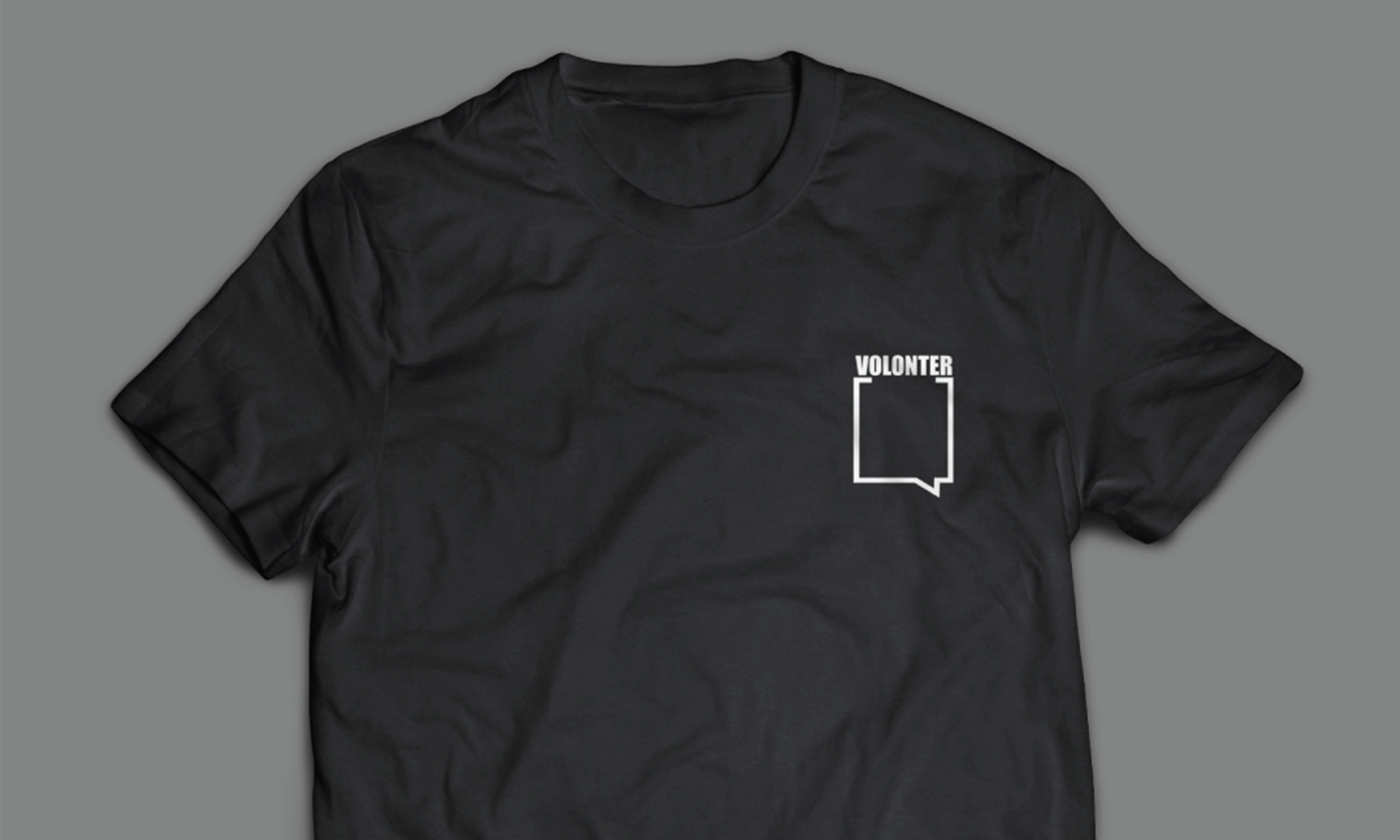
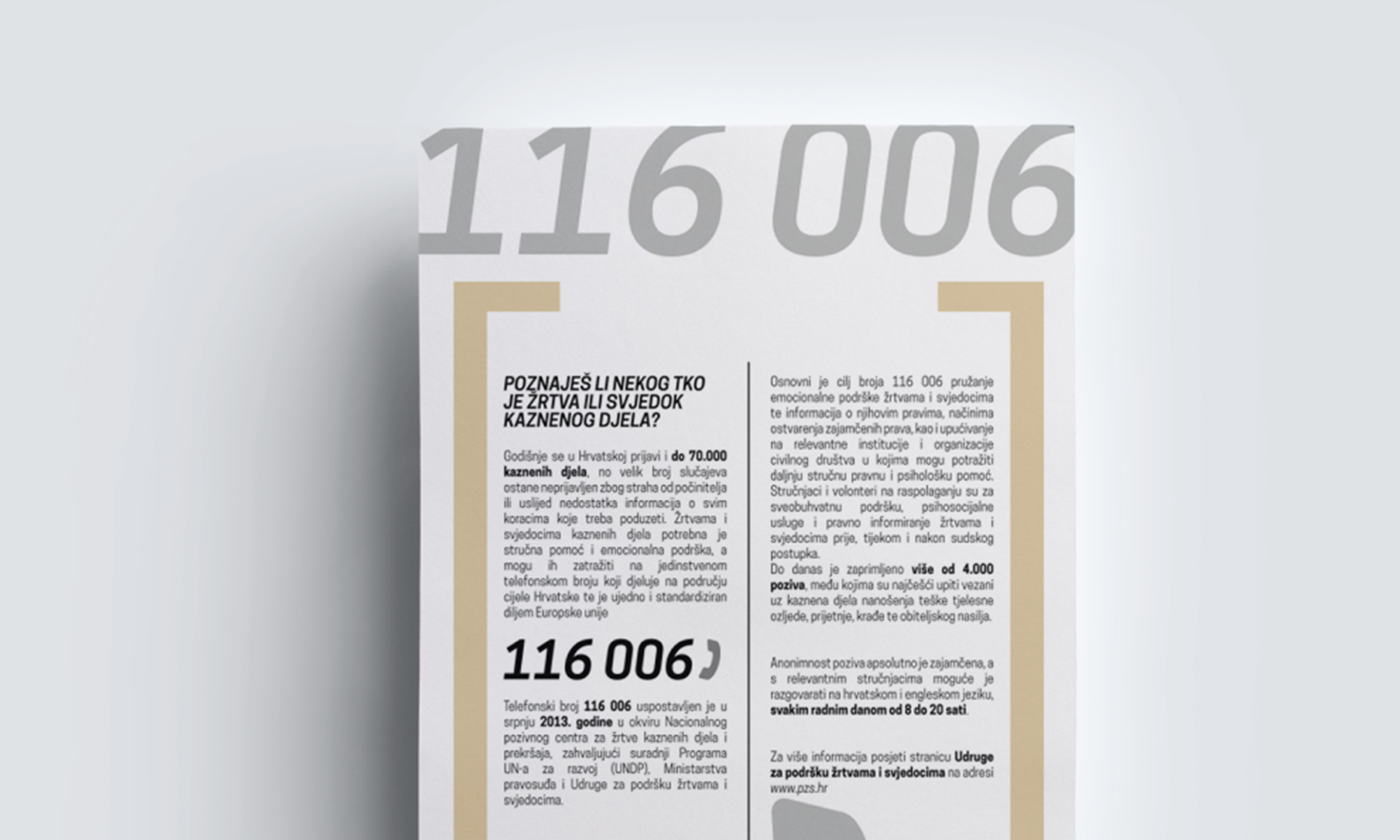
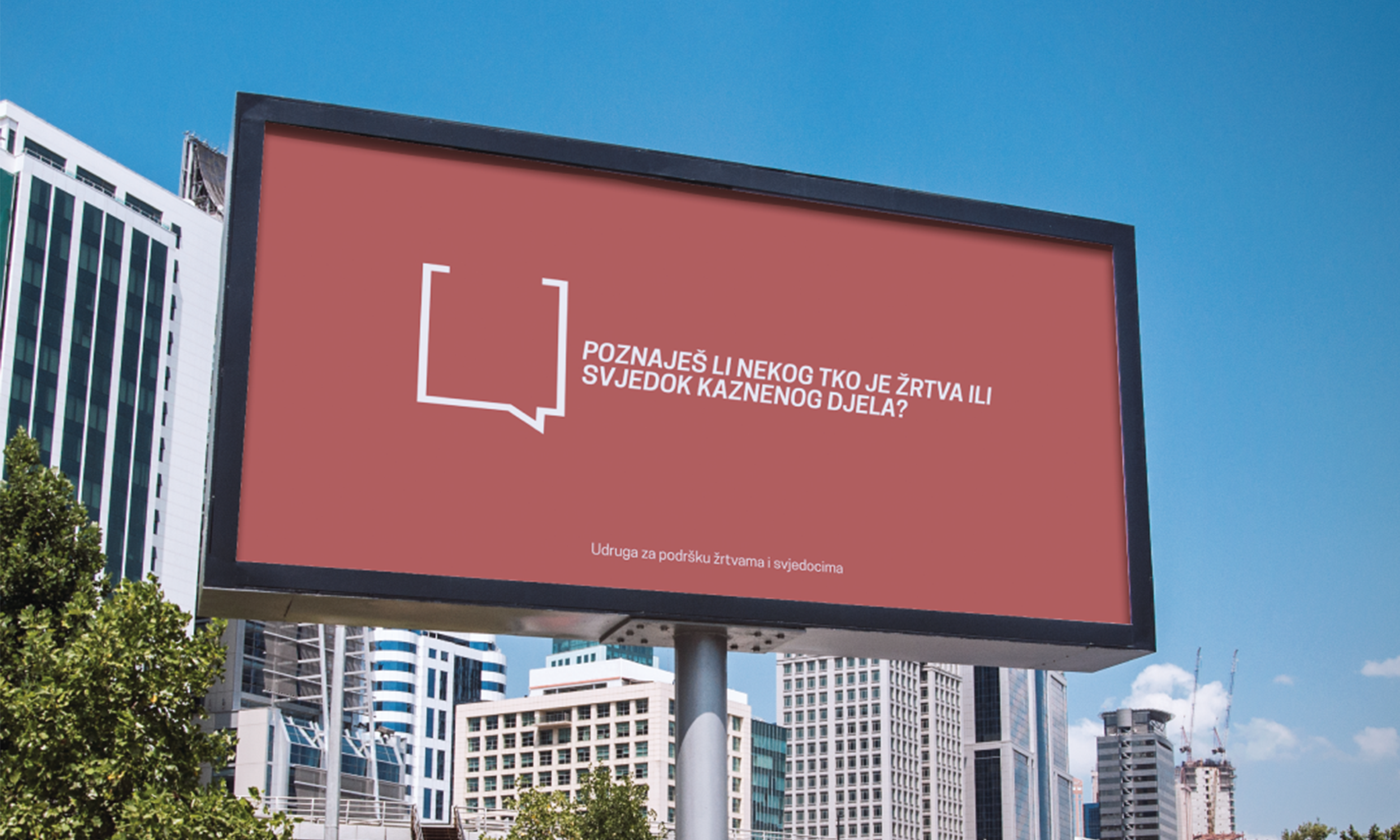
At the core of the project was the creation of a visual language focused on simplicity, consistency and accessibility. The identity was designed to function across a wide range of communication materials, including informational publications, awareness campaigns, promotional materials and digital applications. Consistent application of the identity across these communication channels ensured that key messages remained recognisable, accessible and easy to understand regardless of where people encountered them. This required a flexible system capable of maintaining coherence across different formats while strengthening public trust.
Particular attention was given to communication hierarchy and information structure. Since the project addressed audiences facing challenging circumstances, the design process prioritised readability, intuitive navigation and clarity of content. Typography, colour relationships and graphic elements were organised into a structured framework that supported communication without overwhelming the audience. The resulting system helped create a calm and approachable visual presence capable of supporting the project’s social mission.
Beyond its visual appearance, the identity functioned as a practical communication tool. It provided a consistent framework through which educational content, public information and support services could be presented in a unified and recognisable way. This consistency strengthened public awareness while helping establish a stronger connection between the service and the individuals it was designed to support. The same strategic thinking also underpins projects focused on sustainability branding, where communication helps make complex public-interest topics clear, engaging and accessible.
A key objective throughout the development process was adaptability. The project operated across multiple communication channels and required a system capable of supporting future campaigns, educational initiatives and public outreach activities. By focusing on clarity and long-term usability, the identity provided a foundation that could evolve alongside the project’s ongoing needs while maintaining visual consistency and recognisability.
Developed for the Association for the Support of Victims and Witnesses, the project established a coherent visual language that supported communication, public visibility and access to information. Through a structured and purpose-driven approach, the identity helped strengthen the presentation of an important social initiative while ensuring that communication remained accessible, respectful and easy to understand.
The project demonstrates the role design can play beyond commercial objectives. By combining clarity, consistency and empathy, the visual system provided a framework capable of supporting meaningful communication and reinforcing the project’s broader mission of improving the visibility of public services and making essential information easier to access. This approach shares many of the principles found in communication systems for international initiatives, where consistent visual communication helps connect organisations, partners and communities across different contexts.