Making Local Resources More Visible
Developing a visual identity and communication system for a project promoting the value of small bluefish and sustainable local production.
CLIENT
Grad Zadar
COUNTRY
Croatia
YEAR
2016
SERVICES
Brand Identity · Visual System · Packaging Design · Art Direction · Campaign Communication
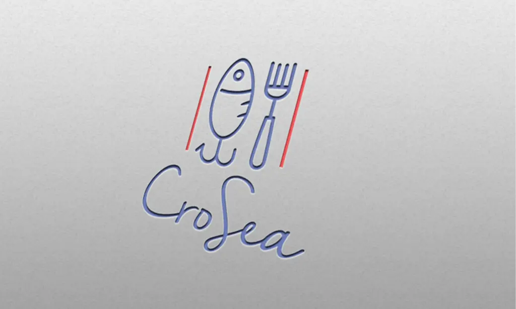
The CroSea project involved the development of a visual identity and communication system for a sustainability initiative promoting the value of small bluefish, sustainable local production and responsible consumption along the Adriatic coast. Initiated by the Local Fishing Action Group in the City of Zadar, the project sought to address both cultural and economic challenges by encouraging greater recognition of locally available resources through a contemporary and accessible approach. The objective was not only to introduce a new product to the market, but also to strengthen public awareness of sustainable food practices while creating a stronger connection between local production, everyday consumption and regional identity.
The challenge was to develop a visual identity capable of communicating sustainability in a clear, engaging and approachable way. The project needed to appeal to a broad audience while raising awareness of the importance of local fisheries and responsible food choices, all while remaining authentic to its origins and purpose. Rather than relying on traditional visual references commonly associated with the fishing industry, the goal was to create a contemporary communication framework that would present the initiative as relevant, accessible and aligned with modern consumer expectations. This strategic approach demonstrates how educational campaign design can help communicate complex topics in ways that encourage understanding and long-term engagement.
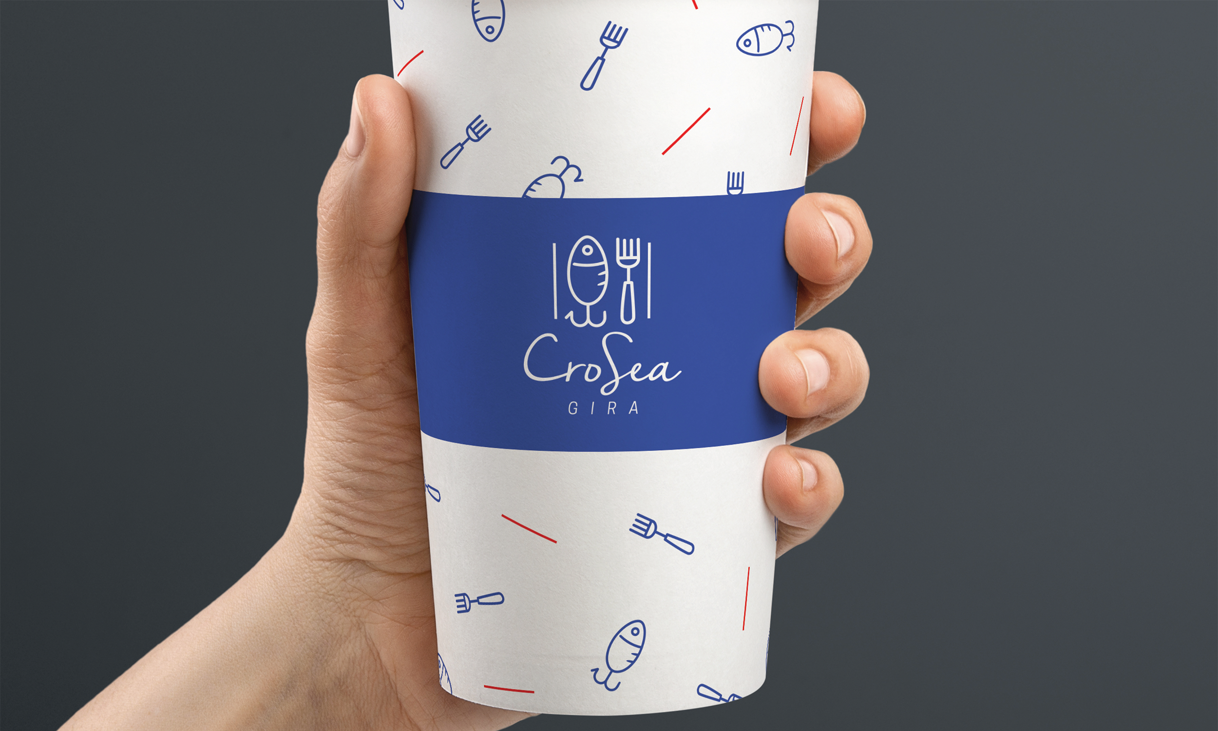
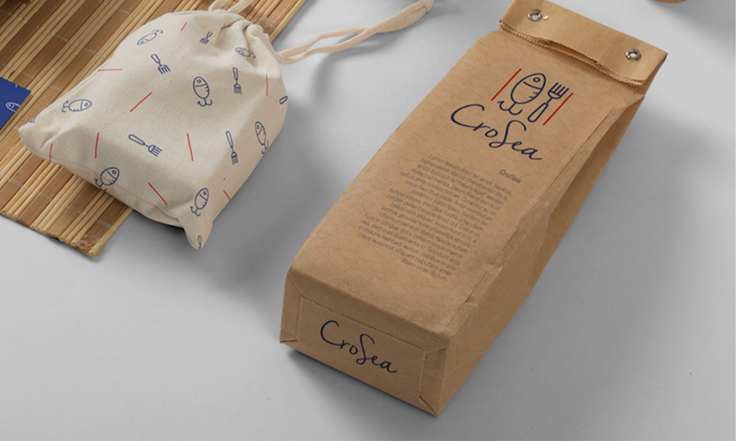
At the centre of the project was the development of a coherent visual system designed to support communication across a wide range of applications. From packaging and promotional materials to digital communication, educational content and public-facing campaigns, the identity needed to maintain consistency while remaining flexible enough to adapt to different contexts. This approach ensured that every communication channel contributed to a unified perception of the project while reinforcing its core sustainability message.
Particular attention was given to clarity and accessibility. The visual language was developed to simplify communication and make information easily understandable regardless of audience or platform. Typography, colour, imagery and graphic elements were carefully organised into a structured system capable of supporting both educational and promotional content. This balance between functionality and visual appeal helped establish a recognisable presence while supporting the project’s broader communication objectives.
Beyond its visual appearance, the identity functioned as a tool for storytelling. It provided a framework through which the project’s values, goals and educational messages could be communicated in a consistent and engaging manner. By creating a clear connection between the product and its cultural context, the identity contributed to a stronger understanding of the importance of local fisheries, sustainable food practices and regional heritage. The same design principles are equally valuable in public awareness campaign design, where clear and consistent communication helps people understand essential information and encourages meaningful public engagement.
A key aspect of the project was versatility. CroSea operated across multiple communication channels and required a system capable of supporting both short-term promotional activities and long-term communication efforts. The resulting visual framework allowed the project to evolve while maintaining coherence, ensuring that future campaigns, events and materials could be developed within a consistent design structure.
Developed for the City of Zadar, the project established a contemporary visual language that supported visibility, public engagement and market recognition. Through a carefully considered identity system and an integrated communication approach, CroSea gained attention as an innovative initiative that successfully connected design, education and local production.
The project demonstrates how strategic design can contribute to broader social and economic objectives. By focusing on clarity, consistency and purpose, the visual identity helped make sustainable practices easier to understand, encouraged greater public awareness and promoted responsible local production through clear and engaging communication. This approach also reflects the value of cultural heritage branding, where design strengthens local identity by connecting communities with the places, traditions and stories that define them.